
Why a Mobile-Optimised Website Grows Your Business Faster
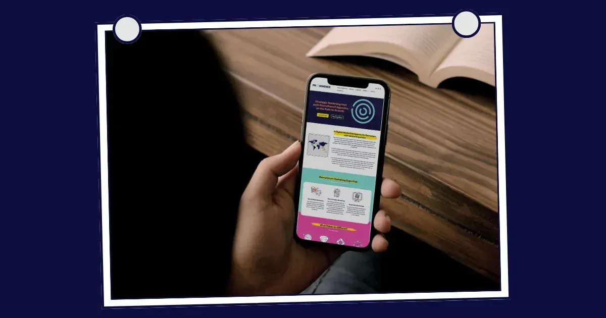
With two-thirds of web traffic now flowing through mobile devices, we’re not exaggerating when we say mobile optimisation is critical for recruitment agency website design.
Over the past five years, mobile web traffic has jumped by more than 20%. That means whether someone’s looking for a job on their lunch break or researching recruiters during their commute, chances are they’re doing it on a smartphone. If your recruitment agency’s website isn’t mobile optimised, you’re likely missing out on traffic, engagement, and ultimately, on business.
So why are some recruitment websites still not designed with mobile in mind? In many cases, it’s an oversight. Mobile responsiveness may not have been the top priority when the site was first built, or hasn’t been revisited during updates. In any case, a website optimised for mobile is an absolute must-have today for marketing for recruitment agencies.
We’ll walk you through why mobile optimisation is so important for recruitment agencies, how to tell if your website delivers a smooth mobile experience, and how to get your website mobile-ready – so you can attract, engage, and convert more candidates and clients.
First Impressions Matter (Especially on Mobile)
When someone lands on your site from a mobile device and it loads slowly, displays poorly, or is clunky to navigate, they’re gone in seconds. A mobile optimised website ensures your recruitment brand puts its best foot forward. Quick load times, responsive layouts, and easy navigation keep users engaged.
Remember: candidates and clients are judging your credibility in those first few taps!
Higher Rankings, Better Visibility
Google moved to mobile-first indexing years ago, meaning it predominantly uses the mobile version of your site for ranking and indexing. So if your site isn’t optimised for mobile, it could be slipping down Google’s search results, making it harder for candidates and clients to find you in the first place.
Along with a better user experience, a mobile-friendly site is a foundational piece of SEO and digital marketing for recruitment agencies.
Better Conversion Rates
What good is your website traffic if it doesn’t convert?
A seamless mobile experience makes it easier for users to apply for jobs, register interest, or contact your team. Making it easy for visitors to perform the action you want them to do (sign up, apply, contact) will enable your conversion rates to grow.
It Future-Proofs Your Recruitment Website Design
User behaviour is always evolving. Optimising your site for mobile ensures it can keep up with changing user expectations and device types. A good recruitment agency website design today should anticipate tomorrow’s tech.
Think about integration with your ATS, CRM, social media platforms, and even tools like voice search. Having a website that is agile enough to adapt to new tech is a big advantage.
It Supports All Your Other Marketing Activity
Social ads, email newsletters, job alerts… Where do most people click through from those channels? Their phone.
If your website is the centre of your digital marketing ecosystem, then mobile is the bridge that gets people there. An optimised mobile experience increases the ROI of every other marketing effort you’re running.
Signs Your Website Isn’t Mobile Friendly
Not sure where your site stands? At a glance, here are a few red flags:
1) Text is too small or runs off-screen.
If users have to squint, scroll sideways, or zoom in just to read basic information, your site isn’t doing its job. Mobile-friendly websites adjust text size and layout automatically for smaller screens.
2) Buttons are hard to tap.
On a phone, buttons need to be big enough to tap without precision thumb gymnastics. If clickable elements on each page are too close together or too small, it creates frustration and increases bounce rates (visitors clicking away from your website).
3) Pages take more than three seconds to load.
We’re not telling tales when it comes to website load speed for mobiles – 47% of users expect a site to load in two seconds or less. Slow-loading pages on mobile are a major reason visitors give up and go elsewhere.
4) You have to pinch and zoom to read anything.
If users constantly need to zoom in just to read job ads or navigation menus, your site isn’t responsive. A mobile optimised layout presents content clearly and accessibly, without extra effort from the user.
5) Google Search Console tells you so!
Google’s free tools will flag mobile usability issues, like touch elements being too close or content wider than the screen. If you’re seeing warnings in Search Console, your site likely isn’t passing the mobile-friendliness test.
Optimising for Mobile: Quick Tips
Two areas where recruitment businesses can score quick wins when optimising their website are job vacancy pages and the registration page for applicants.
1) Keep job descriptions short, clear, and easy to scroll on mobile.
Dense blocks of text can overwhelm candidates on a phone screen. Besides, too many requirements may discourage great applicants from hitting ‘Apply’. Focus on what really matters.
2) Simplify your application forms so they’re mobile-accessible and quick to complete.
Long forms with too many fields can cause candidates to abandon the process altogether. Ideally, applications should take less than five minutes. Test it yourself on a smartphone to find any sticking points.
3) Use ‘sticky’ call-to-action buttons.
Sticky or fixed-position CTAs like “Apply Now” or “Contact Us” stay visible as users scroll, making it easier for them to take action without hunting for the next step. This is a helpful way to improve your website’s conversion rates, by keeping key interactions front and centre.
4) Use compressed images and lazy loading.
Large, uncompressed images can seriously slow down mobile load times. Use image compression and lazy loading (where images load only as users scroll) to keep your site fast and responsive.
5) Test regularly on different devices.
Don’t assume your site works everywhere just because it looks good on your phone! Test on multiple devices and browsers (iOS, Android, Safari, Chrome, etc.) to catch layout issues or broken elements before your users do.
So, What’s Next?
If you’re serious about marketing your recruitment agency, a mobile optimised website is non-negotiable.
At Prominence, we work with recruitment agencies to create websites that perform and look good on every type of device. We make sure your digital presence is working hard on every screen.
Want to know how your site stacks up?
Get in touch
for a website audit and start turning mobile visitors into measurable results.
Our Case Studies
Below is a selection of our case studies showcasing the projects we’ve delivered, the sectors we specialise in, and the long-term partnerships we’ve built. Each one highlights the challenges faced, the approach taken, and the results achieved.


Sound like we could be a good fit for you?
Fill in the form below and we'll be in touch to see where your recruitment business is heading and how our ready-to-go marketing team can support you.
Ready for a chat
We will get back to you as soon as possible.
Please try again later.